_20260317114543.png)
Photography
Approach and structure
Oxford’s photographic style is elevated and sophisticated—never corporate. The Oxford brand uses soft gradients from abstracted images, so when selecting stock images or creating original brand images, play off the softened effect with shallow focus, small depth of field, layering in the frame, reflections in windows. This creates depth, interest, and/or range.
Oxford Digital Library
Imagery Examples
When using stock imagery that isn’t specific to a place, any image chosen has to be ambiguous enough that it could be anywhere.
Headshot portrait art direction
Executive Team Headshots
This series of headshots should feel individual with variations, but still connected as a group.
• Natural light
• Office environment but not corporate stock scenes
• Try inside, outside, through windows, layering greenery in the frame
• Lean into a wider range of backgrounds, poses and crops for the EC headshot suite.
• Real situations and spaces (no homogeneous class photo shots, no solid colour background)
• Shallow focus, small depth of field, soft backgrounds
• Rich blacks and cool tones
• Blue black/neutral suits, no busy patterns or colours for wardrobe
Employee Headshots (Including EC Team)
This series of headshots should feel consistent across every employee.
• People will be close-cropped and put on another background
• Consistent lighting and framing
• Ensure shoulders are completely inframe for different crops
• Rich blacks and cool tones
• Blue black/neutral suits, no busy patterns or colours for wardrobe
Functional headshots close-cropped with branded background
Image treatment
The Oxford brand uses soft gradients from abstracted images. The colours extracted from the people and places at Oxford create their own palettes and get brought to the forefront of the brand visuals. Within each image, many organic colours emerge. The following pages outline rules around creating and applying the image treatment.
Oxford Digital Library
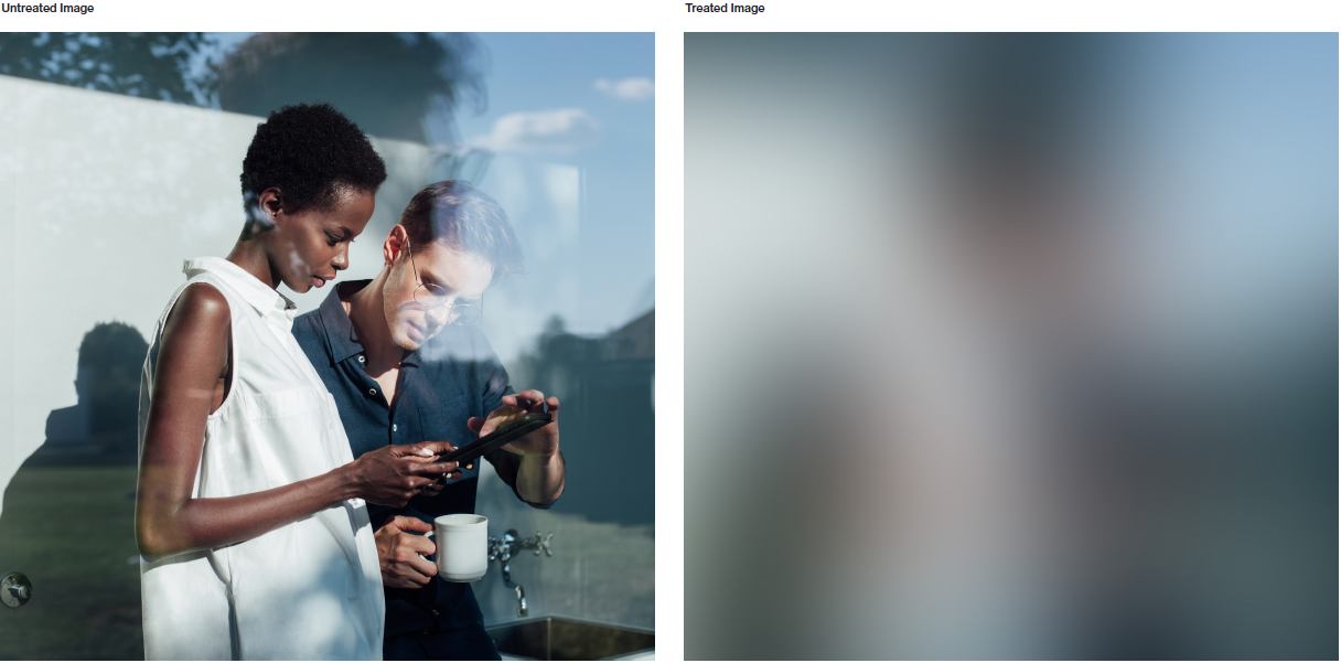
Finding the right amount
Creating the “Oxford Blur” effect is highly dependent on the size of the image. The intention is to abstract it enough to remove fine details in the image, but not too much to wash the image out and lose the blend of different colours.
Cropping and zoom
There is flexibility with the treated images in layout that considers scale and cropping.
A section of the layout can use the treated image at the same scale and crop as the unedited image for a seamless transition. The treated image can also be scaled up and cropped differently for contrast to the unedited image. This is also helpful when placing text over the gradient, allowing you to find proper contrast to the text in layout.
Image-based covers
The treated image effect or gradient can be used as a way to “reveal” a full bleed image. Match the scale and crop of both images and place the unedited image on
the second slide for the reveal in a two-beat presentation cover.
This example for a presentation cover shows the first page using a treated image with content and text placed over.
The photo is then fully revealed here on the second page, allowing for the image/asset to be completely undisturbed, and to become highlighted.